Running adwords, Facebook ads, or even pouring time and effort into SEO campaigns only to drive traffic to a landing page that doesn’t convert is maddening. It’s also a waste of resources. Even if you craft a fantastic ad, your landing page must walk the visitor from curious clicker to lead. This is an art and a science, and its why designers and marketers charge so much to develop high-converting landing pages.
If you have the budget for it, get a pro to build your landing page. If you don’t, learn how to do it yourself until you can raise the capital to hire someone.
Follow these – tips and you’ll build a landing page that converts visitors into leads, and leads into sales. Even if you do have the budget to go pro, you can use these tips to evaluate what the marketer has designed for you.
3 Steps To Designing a Landing Page That Converts
- Every Page Must Have a Clear, Powerful Headline
Many businesses make one of two mistakes when developing landing pages:
- Their headline is weak and does nothing to inspire visitors to take the step of buying/signing up/calling.
- Their headline is well-written, but is confusing or doesn’t mesh with the test of the ad and landing page
Writing great headlines has been the subject of countless books and sales courses, so it’s beyond the scope of this article to explain it fully, but if you lead with benefits, ask a question or create interest, you’ll be head-and-shoulders above your competition.
If you manage to create a great headline, don’t waste it by matching it to a landing page with text that doesn’t quite fit the main message. Also, keep your headline in form with your ad text. The headlines of your ad and landing page can be very similar, or at least close enough so that your visitor knows they’re in the right place.
- Bullets are Weapons
The current fashion is to build a great headline, then follow it up with a few bullet points worth of text, then ask for the sale or sign-up.
Great idea. But choose your bullets wisely.
Bullet Points
In reality, bullets are just sub-headlines, and should be bursting with benefits. Not features! Don’t waste a bullet telling me your product is blue unless that somehow benefits me. Now, you can say
- Our Widget Only Weighs .5oz, So it Fits in Your Pocket (and we now offer it in blue!)
That statement pairs benefit with feature, which is common practice on landing pages and sales letters because it’s proven to work. In this case, it’s a good idea to follow the bold benefit, and italicized parenthetical feature.
Pick your strongest 3 – 5 benefits and turn them into your bullet points. Put your strongest first and last, since your last bullet point will be just above, or to the left of the call to action.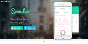
- Call to Action Better Call Them to Action
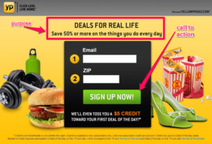
Your call to action is vital. Weak CTAs lose leads.
Online, most companies turn to the simple, and ineffective, “Submit” to get the customer’s info. Submit is a terrible, boring, and is loaded with subversive subtext. No one wants to submit to anything, especially when giving their info to strangers online.
Use strong CTAs on web forms:
- Click Here (basic but proven to work)
- Click Here + Benefit (Click Here to Get Your 10% Discount/Free E-book/Free Estimate)
- Yes! Give Me My Benefit (discount/info/estimate)
Match the benefit in the CTA with the major benefit promised in your headline for maximum conversions. For more tips on converting using inbound methods check out our optimization page.
