
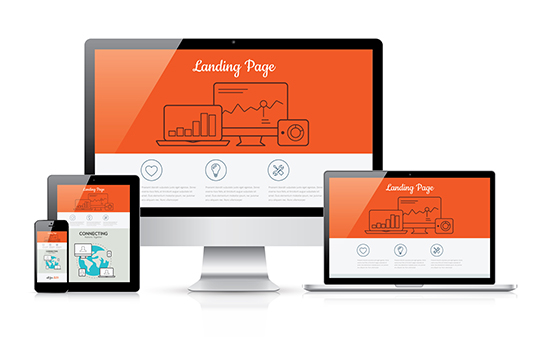
Landing pages are still the most important pages on your website. They are the funnel that allows you to convert your ad traffic and social media traffic into paying customers. landing pages are the pages that showcase your value proposition, your product and close your leads. These landing pages are the life blood of your business. At Retaliate1st, we specialize in developing landing pages that convert, that achieve their goal. We want to showcase the landing page mistakes we continually see, so that your business can thrive.
Why Your Landing Pages Don’t Convert
- Too Many Options
Barry Schwartz wrote about the paralysis that sets in in many shopping situations in his book the Paradox of Choice. He uses the example of a man shopping for shampoo at a grocery store. He is faced with hundreds of choices – for dry hair, for brittle hair, for oily hair; olive oil base, coconut oil base; flower scented; and just about every color imaginable. This leads to frustration, and often people with either simply leave the store, or buy the closest option and later be unhappy with it.
Now, take a look at your landing pages. Are they leaving your customer in the isle frustrated because there are so many options they’re not sure which to choose?
If so, narrow it down to one choice (two, maximum).
What’s the goal of your landing page?
Email opt-in? Make sure the opt-in form is easily accessible, easy to read, and has a strong, clear call to action.
Do you want phone calls? Make your number big and visible and clickable.

Would you take either a phone call or a web form opt-in? Make it clear that either option gets them the same result: contact, free estimate, discount, services, etc.
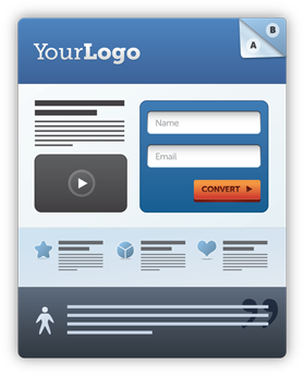
- Too Many Visual Distractions
It can be tempting to overwhelm your visitor with slick graphics. You may think you’re helping them find their way to your CTA.
But, there is a point where the graphics cause confusion.
When using infographics, pictures, video, or graphics, make sure they are absolutely essential to achieving the page’s goal. If they’re not, cut them. You can use them elsewhere (Thank You page, in email marketing, on blogs or pages).
Customer Centric Landing Pages
Put yourself in your customer’s shoes. They’re asking “What am I supposed to look at?”
If your landing page is littered with graphics, it will confuse them. This includes going overboard with exotic background colors, text colors and fonts, and headline sizes. Keep it simple… white background with black text is still the best option because it’s easiest to read.
- Entry Pop Ups
Pop up windows upon entry are, unfortunately, overused. Some sites will display the pop-up every time you refresh the page, visit a new page on the site, and every time you vist the landing page, even if you’ve already opted in. IT can be frustrating for your user, especially if they’re viewing your content on mobile.
Your better option is to use an exit pop-up. At this point, on a true landing page that you’ve driven traffic to, if they’re leaving, they’re gone. An exit pop-up is a last-ditch effort to salvage the lead. It can work fairly well, and will increase your leads significantly over time.


