Posts

website

Sales is the life-blood of any B2B business. Feeding the pipeline and closing become the challenges that all sales driven companies will focus on. I believe you should keep it simple and master the art of inbound marketing to get your audience development going. Here we discuss 4 key elements that can help you amplify your website and generate more sales.

Free

There still is no more powerful word in copy writing or web copy than Free.

Even if you are selling a high priced service or product, Free still reels them in.

Ever notice that high end car brands offer you the opportunity to Come in for a Free Test Drive?

All test drives are free, of course. But, they position it in a way where they’re giving you something. It’s subtle, but it works.

Same goes for:

  • Free Estimate
  • Free Inspection
  • Free Information
  • Free Whitepaper or Tip Sheet
  • Free eBook
  • Free Samples

You

If Free is the most powerful, You is a close second.

you

Good web copy, no matter what kind of business you run, should focus on the customer and how they’ll benefit from your product or service.

Even if you are using the Velvet Rope approach, you still need to focus on why the customer will benefit, or want to gain access to what’s behind the rope.

Scan your marketing materials: your website, your flyers, your direct mailers, your business cards, etc.

Highlight every time you use I or We.

Can these be changed to You?

If so, change them. Your customer will never tire of hearing about themselves or how they’re going to win by choosing your company.

Questions

Use questions for headlines and sub-headlines on your site and in your marketing.

Inject a benefit into the question whenever possible, then reinforce the benefit in the subhead.

For example:

Header: Where Can You Go to Find a Great Chiropractor?

Subhead: You Can Stop Suffering Sleepless Nights with a Bad Back!

Sub-Sub Header or Opening Line: Smith Chiropractic Can Cure Your Pain – Come in Now for a Free Back Inspection

There you’ve used a question to flag your customer’s attention. You injected You and Free into the copy, and you’ve laid out benefits in the answers.

Savings

This one can be tricky if you’re going after a high-end audience. But, if you want to help shoppers looking for a reasonable price, the words Saving, Savings, and Discount are powerful attention grabbers.

card

You can reverse this if you are offering a high-ticket service or product by painting your competitors into the “savings” category, implying that your service is superior while theirs is best left to price shoppers.

 

Google and Facebook pay per click have offered small businesses a method for competing with much larger competitors by allowing for sane advertising budgets with ads that are immediately trackable.

You can figure out your ROI from PPC ads pretty easily.

But, sometimes those figures can be depressing.

If your website or landing pages are not converting for you, stop wasting time trying to perfect your ads (you’re already getting traffic). Instead, use these three tricks to convert more of your visitors into leads:

analytics

Hail Mary Lead Generation

If you’re paying for traffic, you want to convert as many customers as possible. You can help your efforts by putting in some last-ditch, about-to-bounce-away lead conversion tactics.

Do this by:

  • Offering a Benefit-filled Exit Pop Up – these are annoying, but you can set them to only display one time to no annoy repeat visitors. And, if someone clicked an ad to find you and they’re about to bounce away from your site, you don’t have much to lose. Some companies convert as much as 23% more traffic by using exit pop ups.
  • Use a P.S. in any web or off-line marketing materials. Some people skip right to the P.S., so make it count. This goes for email and social media marketing as well.
  • When writing a P.S., or using an exit pop up, lead with benefits and let the customer know why they’ll be losing something if they don’t buy or submit their info.
  • Back up their fear of loss by giving them something to gain
  • Utilize Online Chat – These can be effective if you are selling a product or service that will undoubtedly lead to more questions than you can anticipate or answer in your FAQ. Use live agents because customers are frustrated by dealing with computer-based chat “agents.”

Encourage Your Potential Customer to Take a Very Low-Risk

This is key if you’re selling personal services, high-end products, or anything that costs more than a few dollars. Let your customer get something for free (eBook, white paper, tip sheet, samples) in exchange for something low-risk (their first name and email address).

computer

Further Lessen Their Risks by Being Honest

You love your product. You could talk about it all day. You have no idea why everyone in the world wouldn’t want one!

But, let’s be honest, we’re all customers. We know when we’re on fire for a product vs when we’re on the fence, or still in the research phase.

If you’re still in the info-gathering stages, what’s the last thing you want after you’ve put your info into a website’s contact form?

  • Pushy, shark-type sales people calling your house
  • Getting spammed with multiple emails

Overcome this fear by being honest in the P.S., or under your call-to-action:

  • We promise no salesmen will call your house
  • We respect your confidentiality and never sell your information
  • You will receive only one email with the information you asked for

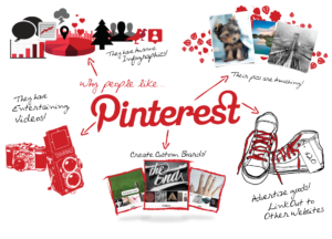
Studies show that Pinterest is one of the fastest growing social media sites in the world. Almost 3,500 pins are posted every minute. And, not only does Pinterest have a huge, active audience, it also has consumers with a buyer’s mindset:

  • They’re 10% more likely to buy than users that come from other social media sites
  • Pinterest drives more than 300% revenue per click than Twitter, and nearly 30% more than Facebook

So, why aren’t more of use utilizing Pinterest as a lead and sale generation source? Usually it is a misunderstanding of the power of Pinterest.

pinterest-marketing

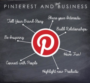
How To Use Pinterest For Lead Generation

  1. Profit from User Generated Content

Some clothing retailers are putting user generated content to great use by utilizing contests. Before and after’s, or “favorite products” for the holidays.

Users take pics, turn them into pins, and share them on their boards along with their email address.

  • One company saw a 23% increase in re-pins, and that led to an increase of 44% in revenue per click
  1. Pins as Social Proof

Your business can never build too much credibility online. Reviews, testimonials, and awards go a long way to helping your business’ reputation.

But, what’s even more powerful is user generated content.

Many companies are using pins of their customers using or wearing their favorite products. What a beautiful way to use “live action” testimonials of people just like you…

 pinterest3

The company then re-pins, using a “shop now” call to action. This has led to click increases of 25% or more.

Encourage your customers to pin pics or videos of themselves using your products or enjoying your services. This is powerful social proof, and allows your product to be displayed in the real world, by real people.

  1. Reward Referrals

Create custom welcome messages for traffic that you drive to your Pinterest home page.

Offer discounts, coupons, free shipping, free estimates, etc. to reward referral traffic.

This gives you a great opportunity to make that new traffic stick, and to increase opt-ins and follows.

Plus, giving things away for free is still one of the most powerful ways to create trust and loyalty in your customer base.

Email is still the number one channel for driving sales for e-commerce business. For many years marketers have touted the decline of the channel, but it is still here. It is still getting strong. With new tools such as AppBoy, Marketo and HubSpot, the abilities for customizing and refining campaigns is endless. However, the original principals of email marketing still hold true. Retaliate1st list their guide to increasing your open rates.

How To Increase Your Email Open Rates

  1. Don’t Send Unnecessary Mail

As business owners and growth hackers, we subscribe to a ton of mailing lists. We consume info at an amazing rate. Some of the lists are better than others, and though we love to learn, we all know that there are those businesses that send garbage email blasts. It annoys us, but we stay subscribed. Then they do it again. We unsubscribe.

They lost a warm lead.

email-3

Don’t be like them. Keep your mail marketing messages to the most important. Do not simply send out blasts because you think you should.

New product, really exciting news, a big re-cap of the latest info, discounts, sales, or free stuff? Send it.

Short emails pushing half-hearted promotions because you either feel you haven’t emailed enough, or you want to generate a few extra sales? Don’t send it.

  1. Personalize Your mail

Yes, we all know that it’s auto-generated, and most customers realize that at this point.

However, seeing our names in the subject is a powerful attention grabber.

email-4

Dear Customer, or Hey Business Pro are horrible ways to start an email. Hi Jennifer or Good Morning Darryl are going to get your email opened, and will get your first few lines read.

  • You can further increase your open rate by adding “Re:” before the personalization, even if it’s the first email in the chain. This can be used in your personal and intra-office communications as well, though over-doing it will diminish it’s power.

Personalization and Targeting

You should also personalize your “From.” Use your name or Name + Business. Jim at WidgetCo or Domenica from SalesBooster gives your list a warmer feeling than an email from SalesBooster.

  1. Write Powerful Headlines

We’re talking about email marketing. Remember that every word you write for your business is marketing. And, email subject lines are pure copywriting.

Weak subjects don’t get opened.

If you are doing a lot of email, it can be fatiguing to come up with killer headlines consistently. The way around this is to split test subject lines, and parse your list so that you can use variations of the same subject for multiple parts of your audience.

  • The words Free, Incredible, Sale, Deal, and Discount are always powerful
  • Name + benefit is still a great lead
  • Re: Name + benefit is even better (save this for your most important email)

emails

While it can be tempting to write “weird” subjects to get higher open rates, please remember that they have to relate to the content of your email, your product, and your brand. For example, one large personal training and fitness related business was famous for sending out emails with salacious subject lines that had zero to do with their product:

“Weed, whores, and whiskey”

“Re: A duffle bag full of guns”

“Re: Are you in the mafia?”

They’re now out of business.

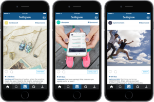
Instagram is still considered by many in the pay-per-click marketing word, to be the new kid on the block. With newness comes a bit of fear, so many small and medium businesses have been hesitant to stray from using only Google and Facebook PPC.

instagram

But, it can be a huge lead booster if utilized properly. Here’s why?

Using Instagram To Create Leads For Your Business

  1. Visual Marketing is a Dominant Force

Content marketing rules, and will continue to be the most useful form of marketing for years to come. As the internet becomes more available in non-PC forms, phones, tablets, watches, etc., the need to turn to non-text content will be essential.

You can do this with visual content, and Instagram is the perfect place to put your best visuals to work.

Simply, visual attractiveness in an ad or in any piece of content that has the goal of increasing conversions, leads to more opt-ins, engagement, leads, and sales.

instagram-2

It will also get you more shares, and that increases each campaign’s reach exponentially at no cost to you.

Using high-quality, bright pictures, you draw the attention of your followers, and can help lead them on the path to purchase.

Instagram Videos

Now with videos in the Instagram feed, you can really skyrocket your leads and sales through the social media site. Video content on Instagram gets more views, shares, and likes. It stops scrollers in their path. Once you become known for putting out good video, you’ll be well on your wall to dominating your market online.

  1. Young, Money-Spending Graphics

In Television, for years the most coveted demographic was 18 – 54 year old males.

Now, it’s men and women 18 – 34 (with 18 – 54 being not far behind). Instagram is custom made, literally, for those in that demographic. Build a strong Instagram following, and you’ll be tapping into the most lucrative market in the world.

  1. Build Brand Awareness

Instagram allows you to use visual content to reach more customers. Facebook is similar in this respect, but Instagram actually gets more shares.

Post a good video or picture, and promote it. Your target audience sees the cool content, wants to show their friends, so they like and share it. Now, for the price to reach your target audience, you’ve reached them plus the friends they’ve shared with. It extends the life of your ads, exposes your products, services, and your brand to a large, warm-audience. This is key for growing your business, especially if you don’t have an unlimited ad-buy budget.

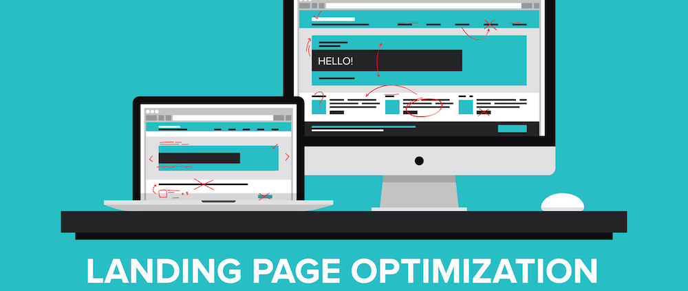
Landing pages are still the most important pages on your website. They are the funnel that allows you to convert your ad traffic and social media traffic into paying customers. landing pages are the pages that showcase your value proposition, your product and close your leads. These landing pages are the life blood of your business. At Retaliate1st, we specialize in developing landing pages that convert, that achieve their goal. We want to showcase the landing page mistakes we continually see, so that your business can thrive.

Why Your Landing Pages Don’t Convert

  1. Too Many Options

Barry Schwartz wrote about the paralysis that sets in in many shopping situations in his book the Paradox of Choice. He uses the example of a man shopping for shampoo at a grocery store. He is faced with hundreds of choices – for dry hair, for brittle hair, for oily hair; olive oil base, coconut oil base; flower scented; and just about every color imaginable. This leads to frustration, and often people with either simply leave the store, or buy the closest option and later be unhappy with it.

landing pages

Now, take a look at your landing pages. Are they leaving your customer in the isle frustrated because there are so many options they’re not sure which to choose?

If so, narrow it down to one choice (two, maximum).

What’s the goal of your landing page?

Email opt-in? Make sure the opt-in form is easily accessible, easy to read, and has a strong, clear call to action.

Do you want phone calls? Make your number big and visible and clickable.

landing-pages-2

Would you take either a phone call or a web form opt-in? Make it clear that either option gets them the same result: contact, free estimate, discount, services, etc.

  1. Too Many Visual Distractions

It can be tempting to overwhelm your visitor with slick graphics. You may think you’re helping them find their way to your CTA.
But, there is a point where the graphics cause confusion.

When using infographics, pictures, video, or graphics, make sure they are absolutely essential to achieving the page’s goal. If they’re not, cut them. You can use them elsewhere (Thank You page, in email marketing, on blogs or pages).

Customer Centric Landing Pages

Put yourself in your customer’s shoes. They’re asking “What am I supposed to look at?”

If your landing page is littered with graphics, it will confuse them. This includes going overboard with exotic background colors, text colors and fonts, and headline sizes. Keep it simple… white background with black text is still the best option because it’s easiest to read.

  1. Entry Pop Ups

Pop up windows upon entry are, unfortunately, overused. Some sites will display the pop-up every time you refresh the page, visit a new page on the site, and every time you vist the landing page, even if you’ve already opted in. IT can be frustrating for your user, especially if they’re viewing your content on mobile.

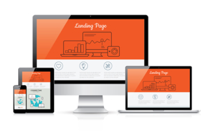
Responsive landing page development vector template illustration

Your better option is to use an exit pop-up. At this point, on a true landing page that you’ve driven traffic to, if they’re leaving, they’re gone. An exit pop-up is a last-ditch effort to salvage the lead. It can work fairly well, and will increase your leads significantly over time.

Running adwords, Facebook ads, or even pouring time and effort into SEO campaigns only to drive traffic to a landing page that doesn’t convert is maddening. It’s also a waste of resources. Even if you craft a fantastic ad, your landing page must walk the visitor from curious clicker to lead. This is an art and a science, and its why designers and marketers charge so much to develop high-converting landing pages.

If you have the budget for it, get a pro to build your landing page. If you don’t, learn how to do it yourself until you can raise the capital to hire someone.

landing-page

Follow these – tips and you’ll build a landing page that converts visitors into leads, and leads into sales. Even if you do have the budget to go pro, you can use these tips to evaluate what the marketer has designed for you.

3 Steps To Designing a Landing Page That Converts

  1. Every Page Must Have a Clear, Powerful Headline

Many businesses make one of two mistakes when developing landing pages:

  • Their headline is weak and does nothing to inspire visitors to take the step of buying/signing up/calling.
  • Their headline is well-written, but is confusing or doesn’t mesh with the test of the ad and landing page

Writing great headlines has been the subject of countless books and sales courses, so it’s beyond the scope of this article to explain it fully, but if you lead with benefits, ask a question or create interest, you’ll be head-and-shoulders above your competition.

If you manage to create a great headline, don’t waste it by matching it to a landing page with text that doesn’t quite fit the main message. Also, keep your headline in form with your ad text. The headlines of your ad and landing page can be very similar, or at least close enough so that your visitor knows they’re in the right place.

  1. Bullets are Weapons

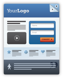
The current fashion is to build a great headline, then follow it up with a few bullet points worth of text, then ask for the sale or sign-up.

landing-page-2

Great idea. But choose your bullets wisely.

Bullet Points

In reality, bullets are just sub-headlines, and should be bursting with benefits. Not features! Don’t waste a bullet telling me your product is blue unless that somehow benefits me. Now, you can say

  • Our Widget Only Weighs .5oz, So it Fits in Your Pocket (and we now offer it in blue!)

That statement pairs benefit with feature, which is common practice on landing pages and sales letters because it’s proven to work. In this case, it’s a good idea to follow the bold benefit, and italicized parenthetical feature.

Pick your strongest 3 – 5 benefits and turn them into your bullet points. Put your strongest first and last, since your last bullet point will be just above, or to the left of the call to action.landing page

  1. Call to Action Better Call Them to Action

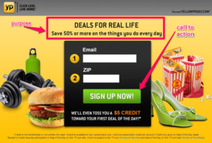
Your call to action is vital. Weak CTAs lose leads.

Online, most companies turn to the simple, and ineffective, “Submit” to get the customer’s info. Submit is a terrible, boring, and is loaded with subversive subtext. No one wants to submit to anything, especially when giving their info to strangers online.

Use strong CTAs on web forms:

  • Click Here (basic but proven to work)
  • Click Here + Benefit (Click Here to Get Your 10% Discount/Free E-book/Free Estimate)
  • Yes! Give Me My Benefit (discount/info/estimate)

Match the benefit in the CTA with the major benefit promised in your headline for maximum conversions. For more tips on converting using inbound methods check out our optimization page.

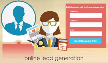
Leads are the life-blood of any sales driven organization. Businesses focus on ways to create more sales opportunities and that means that leads become critical. While driving traffic is important, it is also critical to make sure there is a system in place to capture those leads as they come in. This is why Retaliate1st recommends making an effort to optimize your lead generation via perfecting your web forms. Here we list our 4 ways to optimize web forms for more leads.leads-generation

4 Ways to Optimize Web Forms for More Leads

  1. Don’t Neglect Your Headline

Almost all lead forms come with a space for a headline. Most companies waste this opportunity to gain a lead. You may be super excited about your product or service, but to the stranger who just landed on your page, you are just another business trying to get their email address. What can you do to turn stranger danger into a new business relationship?

lead-generation-graphic

Promise something that they want, and deliver on it. But, get to the point. Your form’s headline should promise a benefit for your visitor – an ebook, a discount, free stuff, etc. Don’t waste prime site real estate being pithy or cute. Promise something that they want, then give it to them.

  1. Don’t Ask Too Many Questions

Or, ask the bare minimum. Studies by Marketing Experiments have shown, over and over, that the more fields you add to a lead form, the lower your opt-in rate. If you’re giving away a White Paper or Discount, then you may only need their email. First Name is usually a safe bet, too. Last Name is going to lower opt-ins a bit. Do you need their phone number? If you do, ask for it. If you’re selling a high-ticket item or service, or you set leads over the phone, then get the number. If you don’t really need it, don’t ask for it.

leads

The Phone Number field can decrease opt-ins by more than 5%. If you do need the phone field, consider making it optional. One site doubled their opt-in rate after adding “Optional” to their phone number field. What about physical address? Again, only ask if you absolutely need it. If you are doing home improvement services or selling home-related items, address may be needed, and simply asking for it will eliminate tire-kickers.

CTAs To Close Leads

  1. Benefit-Rich CTA

Does your call to action button display only the lowly “Submit.” If so, you’re losing leads every day. “Click Here” is simple, direct, and it works. So does adding the benefit – “Click Here for Your Free Estimate,” “Click Here to Download Your Free Book.”

  1. Test Forms

Like any other aspect of marketing, you won’t know what works best on your web forms until you test them. A simple A/B test is a good start. Continue until you find the version that pulls the most. Remember, all these percentages add up quickly when you have thousands or tens of thousands of visitors on your site daily. A 5% dip for a phone number, 4% more for the address field, 2% for “Birthday,” can cost you hundreds of leads per month. This makes testing a must.

Contact

Get in touch

This contact form is deactivated because you refused to accept Google reCaptcha service which is necessary to validate any messages sent by the form.

Address

Retaliate First LLC
1412 Broadway, 21st Floor
10018 New York

Get in touch

hi@retaliate1st.com
+1 (917) 733-0978

© 2019 Retaliate First LLC / Privacy / Terms of Use